When you learn how to bold text in CSS, you gain direct control over emphasis, readability, and visual hierarchy on every page you build. You use bold text to guide attention, reinforce meaning, and structure content in a way users can scan comfortably.
Understanding how CSS handles font weight helps you avoid common mistakes while keeping your designs consistent and accessible.
Understanding What Bold Text Means in CSS
Bold text in CSS is controlled through the font-weight property, which defines how thick or heavy characters appear on the screen. You are not simply turning text bold for decoration, because font weight affects readability, hierarchy, and how users process information. When you understand this concept, you stop guessing and start applying boldness with intention.
Font weight works by selecting an available weight from the active font family, rather than artificially thickening text. If the font supports multiple weights, the browser uses the closest match to your request. This behavior explains why the same CSS value can look different across fonts.
Understanding this foundation helps you avoid relying on HTML-only styling and pushes you toward cleaner CSS-based solutions. It also ensures your typography remains predictable across browsers and devices.
Using the font-weight Property Correctly
The primary way you bold text in CSS is by using the font-weight property, which accepts keyword and numeric values. Keyword values like normal and bold are simple, but numeric values give you more control when the font supports them. When you use numeric weights, you gain precision that helps maintain consistent typography.
Most fonts treat font-weight 400 as normal and 700 as bold, which matches common design expectations. When you apply font-weight: bold, the browser automatically maps it to the correct numeric value. This behavior makes bolding predictable even when you do not specify numbers.
If you want a deeper understanding of how formatting behaves when styling text, reading about what is plain text format can help you see how CSS styling differs from raw text presentation. This context helps you understand why CSS is essential for visual emphasis on the web.
Numeric Font Weights and When to Use Them
Numeric font weights range from 100 to 900 and allow you to fine-tune how bold text appears. Lighter weights work well for subtle emphasis, while heavier weights demand attention without requiring additional styling. When your font supports multiple weights, numeric values give you flexibility that keywords cannot.
You often use weights like 500 or 600 for semi-bold text that sits between normal and bold. This approach works especially well for subheadings or highlighted labels that should stand out without overpowering the page. Numeric values give you visual nuance without clutter.
If a font does not support the exact numeric weight you choose, the browser selects the nearest available option. Understanding this fallback behavior helps you test designs properly across different fonts and devices.
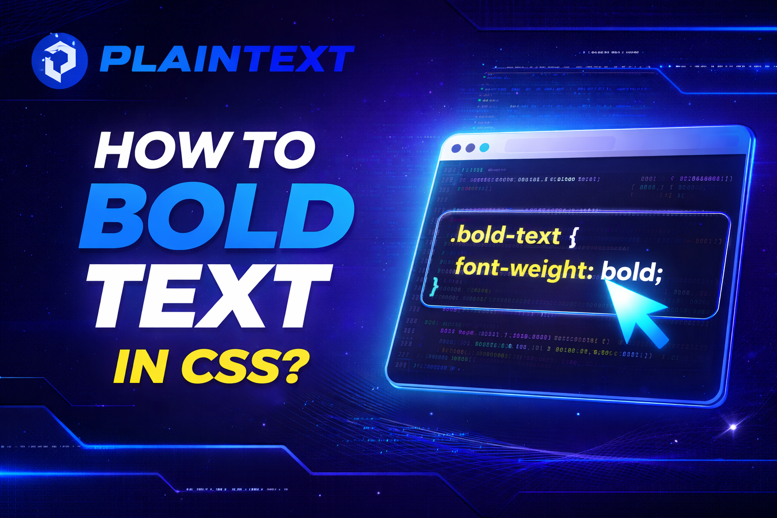
Bolding Text with CSS Classes for Scalability
Using CSS classes to bold text keeps your code clean and reusable across large projects. Instead of applying inline styles, you define a class once and reuse it wherever emphasis is needed. This approach improves maintainability and consistency.
A simple class like .bold-text lets you apply font-weight rules without repeating yourself. When design requirements change, you update one class instead of editing dozens of elements. This method saves time and reduces errors.
If you often work with formatted content and want to understand how text behaves when styles are removed, learning how to copy and paste without formatting helps reinforce why CSS-based styling is so important.
Semantic HTML vs CSS for Bold Text
You may wonder whether to use HTML tags like strong or rely entirely on CSS for bold text. Semantic HTML conveys meaning, while CSS controls presentation, and both play important roles. Knowing when to use each improves accessibility and SEO.
You use strong words when the text carries importance or urgency, not just visual emphasis. Screen readers interpret strongly differently, which helps users understand meaning beyond appearance. CSS then refines how that emphasis looks.
For purely visual bolding, CSS font-weight is the better choice because it separates content from presentation. This separation makes your code more flexible and future-proof.
Accessibility Considerations When Bolding Text
Bold text improves readability when used correctly, but overusing it can harm accessibility. When too much text is bold, users struggle to identify what truly matters. You should use bold sparingly to maintain clarity.
Very light fonts paired with bold weights can reduce contrast and strain the eyes. Testing font weights with real content helps you ensure readability for users with visual impairments. Accessibility is not optional, and font weight plays a key role.
If you want to explore how formatting choices affect usability on smaller screens, reviewing design principles discussed in designing text that works at pocket size can deepen your understanding.
Bold Text in Headings and Visual Hierarchy
Headings naturally rely on font weight to establish hierarchy and guide users through content. You typically use heavier weights for primary headings and lighter ones for subheadings. This structure makes content easier to scan.
Using CSS to control heading weights gives you consistency across pages. You avoid relying on browser defaults, which vary slightly between user agents. Controlled typography improves professionalism and brand identity.
A thoughtful hierarchy ensures users understand the importance of each section without reading every word. Font weight works together with size and spacing to achieve this balance.
Common Mistakes When Bolding Text in CSS
One common mistake is using bold text everywhere to force attention. This approach backfires because nothing stands out when everything is emphasized. Strategic bolding is far more effective.
Another mistake is mixing inline styles with CSS classes, which leads to messy code. Consistency in styling methods keeps your project scalable and easier to maintain. Clean CSS reflects professional development practices.
You also want to avoid assuming every font supports all weights. Testing across fonts ensures your bold text appears as intended and avoids unexpected results.
Best Practices for Professional CSS Typography
You should always define font weights in a typography system rather than applying them randomly. A clear system helps you maintain consistency across headings, body text, and UI elements. This structure saves time and reduces design conflicts.
Using numeric weights where supported gives you better control over appearance. Combining this with semantic HTML ensures both visual clarity and meaningful structure. Professional typography balances form and function.
Regularly testing your text across browsers and devices ensures your bold styling remains readable and accessible. This habit separates polished websites from amateur ones.
Conclusion
When you understand how to bold text in CSS, you gain control over emphasis, clarity, and user experience. You move beyond basic styling and start using font weight as a deliberate design tool.
By applying best practices, testing across devices, and respecting accessibility, you create clean, readable designs that feel professional and intentional.
How do you bold text in CSS?
You bold text in CSS by using the font-weight property. The most common value is font-weight: bold;, which makes text appear thicker and more prominent. You can apply it to any HTML element using a class, ID, or element selector.
What is the difference between font-weight: bold and font-weight: 700?
There is no visual difference in most cases because bold maps to the numeric value 700. The difference is that numeric values give you finer control when a font supports multiple weights. Using numbers is preferred in modern typography systems.
Can you bold text in CSS without using HTML <b> or <strong> tags?
Yes, you can bold text entirely with CSS by applying the font-weight property to any element. This is the recommended approach for styling because it separates content from presentation. HTML tags should be reserved for semantic meaning, not visual styling.
Why is font-weight not working in CSS?
font-weight may not work if the font you are using does not support bold or multiple weights. In that case, the browser falls back to the closest available weight. Always check the font family documentation to confirm supported weights.
What font-weight values are available in CSS?
CSS supports keyword values like normal and bold, as well as numeric values from 100 to 900. Lighter numbers produce thinner text, while higher numbers produce bolder text. Variable fonts may support a wider range of values.
Is it better to use strong or CSS to bold text?
Use <strong> when the text is important or meaningful, such as warnings or key points. Use CSS font-weight when the goal is purely visual styling. Combining semantic HTML with CSS gives the best results for accessibility and SEO.
How do you make text semi-bold in CSS?
You make text semi-bold by using a numeric value like font-weight: 600;. This creates emphasis without the heaviness of full bold text. Semi-bold weights work well for subheadings, labels, and highlighted UI elements.
Does bold text affect SEO?
Bold text itself does not directly improve rankings, but it helps search engines understand content emphasis when used with semantic HTML. Overusing bold text can reduce clarity and user experience. Strategic emphasis supports readability, which indirectly helps SEO.
Can you bold text only on hover using CSS?
Yes, you can bold text on hover using the :hover pseudo-class. This is often used in navigation menus or interactive elements. The effect provides visual feedback without permanently altering the layout.
How do you bold text in CSS without changing layout width?
Bolding text can slightly change layout width because characters become thicker. To avoid layout shifts, you can use a slightly heavier normal weight or reserve space using consistent font sizing. Testing with real content helps prevent visual jumps.